Thursday, October 6, 2011

Download 1514 Paris Verand Font Family Style


Download 1514 Paris Verand Font Family Style

Download 1514 Paris Verand Font Family Style

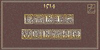
This set of initial decorated letters was inspired by a font in use in the beginning of 1500s in Paris.

Exactly, we have used the set that Barthlmy Verand employed for the printing of Triumphus translatez de langage Tuscan en Franois, (from Triumph of Petrarque) in the year 1514.

Some letters, lacked, have been reconstructed to propose a complete alphabet. It appears that the printer used some letters to replace others, as V, turned over to make a A, or D to make a Q.

More…

The original fonts letters were drawn in white on a black background only, but it was tempting to propose a negative version in black on white.

It is used as variously as web-site titles, posters and flyers design, publishing texts looking like ancient ones, or greeting cards, all various sorts of presentations, as a very decorative, elegant and luxurious additional font.

This font supports strong enlargements remaining very smart and fine.

Its original medieval hight is about one inch equivalent to about four lines of characters.

This font may be used with all blackletter fonts, but works particularly well with 1543 Humane Jenson, 1557 Italic and 1742 Civilite, without any anachronism.

read more

No comments:

Post a Comment