
Based on the S. H. de Roos design, Amsterdam Foundry circa 1923.
Based on the S. H. de Roos design, Amsterdam Foundry circa 1923.
font family
font family from Hoftype, added today
EquipCondensed is the matching complement for Equip and with its 16 fonts it extends of the Equip family to 32 styles. It not only works superbly as a contrasting face for the ‘normal’ Equip but due to its moderate width, it also performs brilliantly as a space saving typeface.
font family from Hoftype, added yesterday
Equip, a new versatile geometric sans face in 16 styles, designed on a geometric base. Low contrasted lines and a sturdy ductus give it a strong appearance. It looks open, generous and unsentimental. A large selection of weights and many useful OpenType features allow an easy adjustment for a wide range of applications, in print and on the web.
family of 3 fonts from Eurotypo
Equalis Stencil is a slab-serif typeface. This OpenType font comes in three weights, alternates and symbols, with support for CE languages.
family of 12 fonts from Hoftype
Epoca-Classic, designed in 2012, is the contrasted sister of Epoca, also suited for text and display.ÂÂ
As is the case with Epoca, Epoca-classic has economical proportions, a neutral appearance and a discreet elegance. It is fresh, crisp and distinguished. Its well-balanced proportions result in an even text flow which allows for pleasant reading even with large amounts of text.ÂÂ

Drawn at the close of the nineteenth century at the Boston branch of American Type Founders, Epitaph was modeled on a graceful Art Nouveau letterform that was bringing a new vitality to gravestone inscriptions at the time.
The energy and life of the Vienna Secession alphabet drew the attention of Tobias Frere-Jones, who digitized the original set of titling capitals and added alternate characters for its Font Bureau release.
family of 1 font from gvmnt
Envy Races is an elegant contemporary typeface based on sharp clean lines.
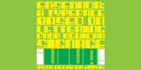
Ensenada is a typeface designed based on hand-cut lettering that adorns businesses throughout the city of Ensenada in Baja California in Mexico.
- What was the inspiration for designing the font? Looking at the hand-cut lettering in Ensenada, Mexico.
Variations on this type of lettering are often used by Mexican pop-techno acts.
- What are its main characteristics and features? It is a geometric display face that works in both retro and futuristic settings.
More…
Digitized handwriting fonts are a perfect way to give documents the “very special touch”. Invitations look simply better when handwritten than when printed in bland Arial or Times New Roman.
Short handwritten notes look authentic and appealing. There are numerous occasions where handwritten text makes a better impression.
“Enrico Handwriting” is a beautiful typeface that mimics true handwriting closely.
Use Enrico Handwriting to create stunningly beautiful designs easily.
Enocenta is an elegant calligraphic typeface created by Jeremy Dooley & Cecilia Marina Pezoa and published by insigne. This family font has five weights, set of alternates, swashes, ligatures, ornaments etc. It is recommanded for display, packaging, magazine, invitation. Enjoy!
Foundry: insigne
Formats: OTF
Glyphs: Any Open Type Features, Basic latin/English letters, West European diacritics, Euro, Ligatures, Central Europe, Baltic, Turkish, Romanian; Only available in some of styles: Open Type Alternates, Open Type Contextual, Open Type Swash, Dingbats & Symbols
Licence:Â Desktop, Webfont
Released: 2013
Price: all 8 fonts $31,60; $79,00
“Enocenta†is a trademark of insigne.
Â

family of 1 font from Jeff Levine
Decorative elements with a decidedly Art Deco flair make up the twenty-six images found in Design District JNL by Jeff Levine. Use these images as embellishments to your next design project.
family of 1 font from Typodermic
Desard is a happy, sweet handwriting font.
family of 1 font from Typodermic
Desard is a happy, sweet handwriting font.
family of 2 fonts from Intellecta Design
This is the Intellecta’s digitization of the fantastic heritage by Charles Derriey. Besides the original ornaments and fleurons, our collection has new interpretations and new designs based in the original work. A tour-de-force by Iza W.
family of 1 font from Sideshow
Dig this cats n' kittens ... A whole heapin' helpin' of tasty art bits from Tiki retro artist Derek Yaniger!
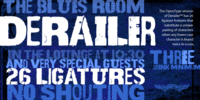
Derailer’s eclectic character set is comprised mainly of disparate sans serif characters that claim to play well together. OpenType users also benefit from 52 ligature features that automatically substitute a unique pairing of letters when any upper or lower case character is keyed twice in a row.
Derailer Pro extends the character set to support Eastern European Latin, Baltic, Greek and Turkish.
font family from Adtypo, added today
Densit is a display mega black typeface, containing 6 styles. It aims for a ultimate density with a maximum weight on a minimum place. Glyphs therefore balances on a slim border of touch. The typeface is designed for expressive and short texts at big sizes and is suitable for photography or other visual materials underlaying. The 3 basic styles parodies ordinary type styles. They only differents from each other lays in the lenght of straight thin lines. The stencil style without these lines is intended especially for spray stencils, the sans style is imitating linear sans types and the serif style having stronger contrast and indicated serifs. The typeface contains a large set of special ligatures for playing with aesthetic qualities of text and obtain maximum space saving. Very short terminals offer compact setting of multi-lines captions. Densit can be used for music posters, eye-catching headlines of art articles and everything in which is possible graphic impression from legibility prefered.
Dense is an elegant, compact sans-serif typeface created by Charles Daoud and published by CDType with three weights Thin, Regular & Bold. It is recommanded for headline, poster.
Foundry: CDType
Formats: OTF, Windows TrueType
Glyphs: Basic latin/English letters, West European diacritics, Euro,Ligatures, Dingbats & Symbols
Licence:Â Desktop, Webfont
Released: 2013
Price: all 3 fonts $60,00;
Â

Dendritic Voltage is a techno font inspired by digital trash. In OpenType savvy applications certain letter combinations are automatically replaced by joined letter pairs. The original narrow caps are available in OpenType apps using the ‘stylistic alternates’ feature.
family of 1 font from Just My Type
Creative people tend to mix printing and cursive, i.e. some letters connected, some not. Why? Who knows? Handwriting analysts have a field day with this sort of thing. Have a field day of your own with Dempsey, based on the writing of Tucson film teacher, media artist and programmer, Vikki Dempsey. It’s fun, assertive and will make you look even more creative.
family of 2 fonts from Tour De Force
Supreme decorative typeface, with wedged display serifs.
family of 1 font from Aah Yes
Just a hint of grunge in this font, one side fairly clean and one side with subtle grunge.


